
These are some old sites I made & I am keeping them preserved here, for posterity. There are some pretty funny ones & you can click the image to see a LIVE version. (some links don't work in the live version) *// LIVE VERSIONS NOT YET WORKING //*
-------------------------------------------------------------------------
Xiratorst
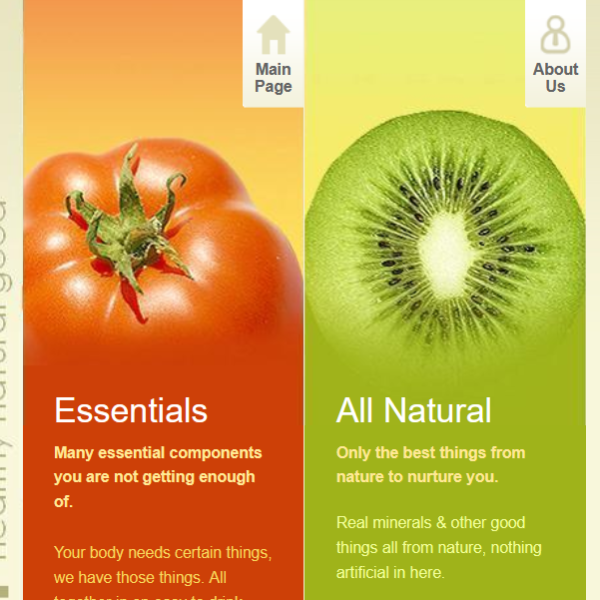
This is a site about a fictitious energy drink. Thirsty?
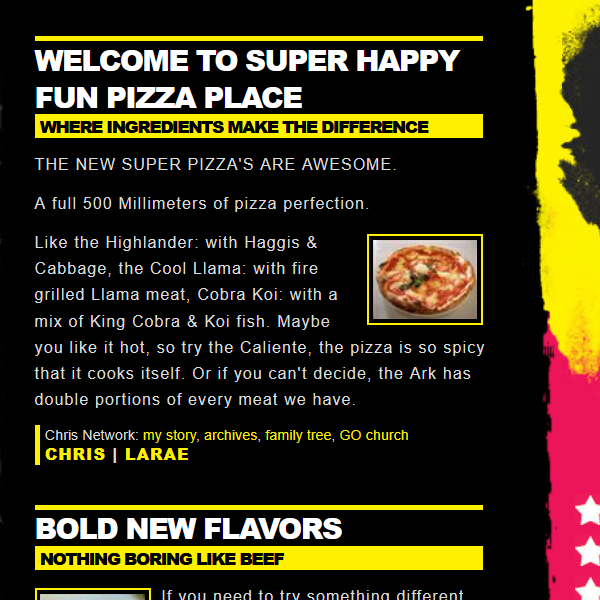
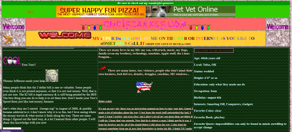
Super Happy Fun Pizza
Order a pie today, only the finest "meats" on these.
Poink
Poink is a, well it's like a, well you can drink it.
Pet Vet Online
How about a site where you can mail in your pet, we fix them, then send them back.
How about a site where you can mail in your pet, we fix them, then send them back.
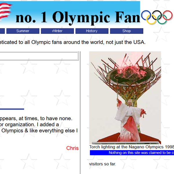
USA Olympic Fan
the U.S.Olympic Committee called me to talk about this site & made me change things.
the U.S.Olympic Committee called me to talk about this site & made me change things.
Worst Webpage Ever
This site was an assault on the senses. It was filled with animations & text that was impossible to read.

It had so much crap on it, that it took forever to load, or just completely crashed your browser. Sometimes it would take down your entire computer. I wish I had the files to recreate it, but even the Internet Archive can't resurrect it.
------------------------------AI text below----------------------------
Here are some reactions from "real" users.
And by real, I mean Artificial Intelligence.
Retro Web Design: A Humorous Look {Gemini}
The early days of the internet were a glorious, lawless frontier where the concept of "user experience" was a secondary concern to whether or not you could make a cursor leave a trail of sparkling fairy dust. Visiting a personal homepage in the late 90s was less like browsing a library and more like walking into a digital funhouse where the walls were tiled with neon-purple textures and every page load triggered a MIDI version of a classic rock anthem.
It was an era defined by a "more is more" philosophy, where no corner was safe from a rotating "Under Construction" GIF or a marquee scrolling text that moved far too fast for human eyes to track.Modern web design has, for better or worse, grown up and moved into a minimalist loft.
Today’s internet is a polished world of clean lines, muted palettes, and intuitive layouts that prioritize readability over visual chaos. While these sleek, mobile-responsive interfaces are undeniably more functional, they can sometimes feel a bit sterile compared to the wild, uncurated energy of the early web.
We’ve traded the flickering fire animations and guestbook hit counters for white space and "hamburger" menus, creating a digital landscape that is far more efficient but perhaps a little less adventurous.
The Retro Corner at ChrisCarnes.com serves as a deliberate time capsule, celebrating the charmingly chaotic aesthetics of that bygone era without making your modern browser crash. It’s a space where the spirit of legacy computing lives on, paying homage to the days when JavaScript was mostly used for obnoxious pop-ups and backgrounds were proudly, unapologetically tacky.
By revisiting these old-school design tropes, the site captures the nostalgia of the early enthusiast web, offering a lighthearted look back at the digital building blocks that eventually led us to the streamlined internet we use today.
Early Web Chaos {ChatGPT}
Back in the early days of the internet, websites weren’t designed so much as unleashed upon the world. Every page looked like a digital garage sale — flashing GIFs, spinning skulls, MIDI files that started playing at full volume for absolutely no reason, and enough neon text on tiled wallpaper backgrounds to permanently damage your retinas.
JavaScript counters proudly announced “You are visitor #000042,” while animated construction workers reminded everyone that the web was forever “UNDER CONSTRUCTION.” It was chaotic, tacky, and honestly… kind of glorious.retro.chriscarnes.com is a tribute to that wonderfully unhinged era of the internet.
This was a time when web design rules were less “clean and responsive” and more “how many flames can I fit around this guestbook?” If your webpage didn’t have at least three dancing animations and a questionable color combination like lime green text on a purple marble background, were you even online?
The internet felt less corporate and polished back then — more like wandering through millions of strange little digital bedrooms built by people who had just discovered HTML five minutes earlier.Of course, modern websites are smoother, cleaner, and far easier on the eyes. Today’s web is full of minimalist layouts, muted colors, and interfaces so sleek they practically whisper “synergy” at you.
And while that’s probably better for humanity as a whole, there’s still something charming about the wild west days of personal websites — when every page felt like a unique experiment powered by caffeine, curiosity, and way too many animated GIFs.
{Claude} just botched this.
I told Claude to write something, but it just spaced out & didn't do anything.